designing website layout – a sketch in a spiral notebook
Website footers frequently get overlooked as a design element, but they can play an important role in your website. They represent an area of the site with a lot of untapped potential to enhance your customers’ experience and deliver some critical information.
We’ve collected five examples of websites developed by Conroy Creative Counsel that have effective website footers. Let’s take a look.
Papetti Samuels Weiss (www.pswfirm.com)
Sometimes simple is best, and that’s certainly the case with Papetti Samuels Weiss’s footer. It includes all the basics: contact information, a simple navigation function and the firm’s logo to provide some branding. It’s clean and easy to read, which works well with the rest of the site’s design.
TTLO Law (www.ttlolaw.com)
Like the PSW footer, this one is clean and simple, with branding in the form of the TTLO logo, and clearly placed contact information.
This site also features social sharing functionality (one click to share to Facebook, LinkedIn, Twitter or email), a link to a contact form and even a client payment feature that will certainly come in handy for existing clients.
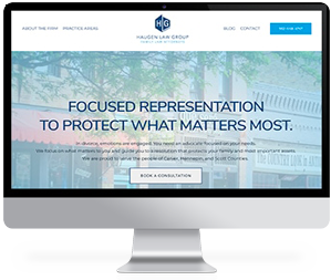
Haugen Law Group (www.haugenlawgroup.com)
The Haugen Law Group site adds a bit of complexity, but still is easy to use. It features a sort of “three column” format. The left column contains the branding imagery and contact information, the middle column features quick navigational links, and the right column features social sharing and even a map to help clients figure out exactly where the firm is located.
The Lisinski Law Firm (www.abogadaangel.com)
This law firm is written in Spanish and designed for Spanish-speaking clients in need of representation for immigration cases. We also used a three-column format for the footer on this site, with the first containing contact information and social sharing and the third containing brief navigational pages.
The middle column features something the other previous entries on this list do not: a brief message to readers to describe the firm’s mission. It serves as a sort of “sending off” or last note for readers who got this far on the page, and sums up what the firm is about.
Jeremy Widder Law (www.widderlaw.com)
The three-column footer format works once again for Widder Law. Under the logo on the left column we added a brief statement that sums up the firm’s capabilities and service offerings, before leaving social sharing buttons. The middle column features navigational links, and the right column focuses on contact information and an area map via Google of the firm’s location.
Want more help in developing a footer that provides your website with extra functionality? We’re here to help—contact us today to get started with our law firm web design services.