It can be frustrating when you’re headed to a webpage only to see a 404 error page. When creating your website, creating a custom 404 page may not be at the top of your list, but it can be worth the time and effort to create one.
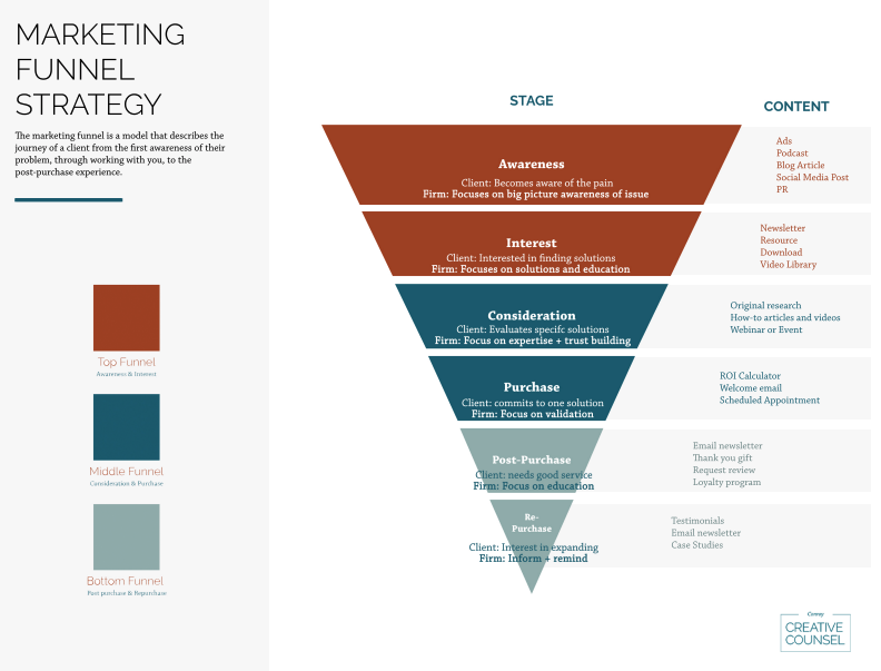
In a perfect world, your clients would never come across a 404 page. But when they do, a custom 404 page can entertain visitors and keep them from leaving your website when they don’t come across what they’re looking for. Also, when you redirect users on a 404 page, you can guide them into your sales funnel, which can result in a boost in sales and more loyal clients.
If you’re looking for ideas on custom 404 pages that will turn website visitors’ negative to positive, we’re here to help. Let’s talk about 404 error pages, look at some of the best custom 404 error pages, and explain why they are effective.
What is a 404 Error Page?
There are a variety of reasons why a website visitor may see a 404 error page. Some of these reasons include
- The webpage was renamed or deleted
- A broken link
- They entered the incorrect URL
The 404 error page lets visitors know that they’ve landed in the wrong spot and instructs them on where they should go instead. 404 pages help keep your website’s user experience (UX) high. Without a 404 page, your visitors will likely leave your website if they don’t know where they can go to get the information they were looking for.
What is a Custom 404 Error Page?
A typical 404 error page is a simple white screen with text informing the visitor the page cannot be found. There isn’t a personalized message, there’s a lot of technical language and an overwhelming amount of text, it’s not on-brand with your law firm, and basically, it’s pretty bland.
Creating a custom 404 error page can give the page personality and help keep visitors from leaving your website. And the great thing about creating a custom 404 page is that there aren’t any rules for what the page should look like. Do you want to present a humorous side of your firm? Maybe you want to keep it short and simple. Your custom page can communicate the redirect to your users however you’d like.
Examples of Custom 404 Error Pages
Here are some great examples of custom 404 pages, what they’ve done right, and what could be improved.
#1. Pixar
Leave it to Pixar to have a creative, fun 404 page! The character from Pixar’s movie “Inside Out” shows how frustrating landing on the wrong page can be!
Their page is meant to bring a smile to the face of visitors who come across it. While there is a main menu at the top of the page to lead you to another part of the website, you may notice that there isn’t a navigation search bar to redirect users to what they are looking for, which may frustrate users.
#2. WPForms
WPForms uses a simple 404 error page. Using “Whoops” on the page makes the page more playful, and it provides a search bar for users to navigate the site.
The great thing about a simple 404 error page like this is that it limits the options available for users, which can be overwhelming. One improvement that could be made would be to add a CTA (call-to-action) button or a link to lead the user back to the homepage.
#3. Netflix
Netflix features a scene from Lost in Space, which can be how it feels when users reach a 404 error page! The great thing about this page is the CTA button that sticks out in the middle of the screen that leads lost users back to the Netflix homepage.
Something as simple as adding a CTA back to the homepage can boost user experience.
#4. Hulu
Simple and to the point. That’s the best way to explain Hulu’s custom 404 page. There are no colors, no pictures, only a simple button that says “OK.” The “OK” button takes you back to the homepage, but you can’t tell that by looking at it. But apparently, it works if a brand as big as Hulu is using it.
#5. Lego
Lego has one of the best on-brand 404 pages. Not only that, but it’s fun and easy to understand. You may notice that there is no reference to a “404 error,” which many people may not understand. Instead, it’s entertaining and to the point.
Choose Conroy Creative Counsel as Your Marketing Co-Counsel
As you can see from the examples above, there can be a creative, entertaining way to explain to visitors what happened and redirect them where to go next. Whether your law firm prefers a humorous approach or a well-designed, simple approach to a 404 error page, giving visitors something to look at when they hit a “dead end” can help keep visitors from leaving your website to look elsewhere.
At Conroy Creative Counsel, we aim to help you establish a strong digital presence with an impactful web design and the technology your firm needs to set you apart from the competition. While law school prepares you for legal battles, a law degree isn’t enough to help you win in the Marketplace. Let our team be your marketing co-counsel.
Contact us today and tell us about your firm!
