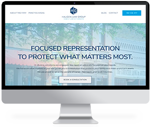
When developing a website, it’s important to carefully think through every aspect of the design. Something as simple as color can play a big role in how people viewing and reading your website will perceive your firm.
For as long as advertising has existed, colors have been used to evoke particular emotions and to encourage specific actions. Let’s take a look at a few examples of colors and the feelings they can evoke in web designs and logos.
- Blue: Blue is a popular color choice for law firms (as well as medical providers, insurance companies and other types of professional services) because it frequently is associated with professionalism, credibility, expertise and reliability.
- Green: Green, as you might expect, is associated with health, nature and relaxation. It is frequently used in the health and nutritional products markets and environmental services. But it also has a place in branding for law firms. Green evokes peace, calm and relaxation, which can be ideal for the law firm that wants to brand itself based on its ability to keep its clients comfortable throughout the legal process.
- Red: Red is bold and powerful, evoking energy, urgency and excitement. It can be a strong statement maker for web design, but should not be overused. Because of the strong feelings it evokes, it’s generally used for attorneys who focus on more adversarial practice areas or who want to advertise their assertiveness or aggression. Think certain types of personal injury cases, or attorneys who focus on litigation.
- Black: Black is usually associated with luxury, sophistication and power. You’ll often find it used for marketing luxury products, films, fashion or businesses looking to create an air of exclusivity. Law firms that work with major corporations or who specialize in high-asset estate planning or divorce cases may use black strategically as a way to position themselves as an “elite” choice.
- Orange: Orange conveys feelings of energy, warmth and action, and is a bright, bold color that instantly attracts attention. It’s often associated with fitness, physicality and children’s activities. Like red, orange should be used sparingly in designs for professional organizations and with the specific intent of making a dramatic impact.
Consider the brand identity you wish to convey as you choose the colors you will use in your website design. When done well, your design and color scheme will speak to your readers just as much as your written content!