When visiting a website, there are so many design aspects that can effectively move your viewer across the page. If you have ever worked with a designer before, you may have heard the term “white space”.
White space is simply any empty space you see around elements on your webpage. It is a very important tool for anyone designing a website to use, as it can effectively improve your client’s experience by creating balance on your page, isolating and highlighting important user interface elements, and increasing the readability of your overall page.
White space can be very powerful when done correctly and can really make your website shine. Let’s look at some examples of how to effectively use white space.
Where to Use White Space
There are two different types of white space: micro and macro.
Micro white space is the space that is found between smaller elements on your page, including:
- Lists
- Icons
- Links
- Buttons
- Lines of text
Macro white space is all of the space between larger elements, like in margins or on the top of your page.
Call to Action Buttons
Call to action or CTA are ways to encourage your audience to come to a final action when doing any marketing on your website. There can be different types of CTAs, that include:
- Sign Up
- Subscribe
- Try for Free
- Get Started
- Learn More
- Join Us
Using white, or negative, space around a CTA button can draw the viewer by making a clear point of where to click, using the right language on the button and separating it from the rest of the article or part of the page.
Borders
Separating certain items create a distinction between the text you are encouraging a viewer to read or for images you are highlighting. Most photos or pieces of text should have a decent amount of blank space around them to avoid cluttering your page.
Text Content
Legibility
Using white space can help avoid your text from feeling difficult to read or too cluttered. But also, when spaced too far apart, there can be disconnection and lose their place. Making text content easier to digest will ensure it is easier to absorb the information and keep your reader interested in your page.
Organization
Humans typically perceive visual elements that are closely grouped together as related, and those that set a certain distance apart are irrelevant to one another. When using white space between your content, you allow viewers to properly assess which information goes together and create a hierarchy of important information.
Add Emphasis
With too much information cluttered in one area of your page, a viewer can lose the message of the page with all the excess. The more white space around a certain object or piece of text you add, the more you draw the visitor to the most important part of the page.
Gives Your Content Structure
Using white space can direct the eyes and visually guide the hierarchy of information on your page and guide the direction it goes in. Readers typically begin reading in the top left corner of the page or paragraph, as you would when reading a book or a billboard. You can add more emphasis on an object by doing the opposite as well.
Image Galleries and Illustrations
Image galleries can maximize white space, add symmetry between other elements on your page, give additional objects for your client to interact with, and help with the overall design of the page visually. Images and illustrations also can be used to relate the image to the content in a paragraph before the reader even reads it.
In Blog Posts
Adding white space in your blog posts helps with legibility and comprehension of the information in your content. Paragraph margins and line spacing (the amount of space between your lines in a paragraph) can drastically improve the readability of your body of text. More spacing between lines usually can offer a better experience for the reader, but be aware that too much space can disconnect the design. Headers, the use of bullet points, and text size all can organize your entire blog post.
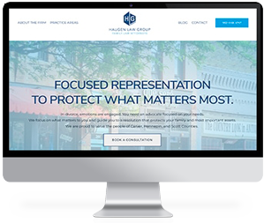
Designing the Best Law Firm Website
It’s easy to want to fill all the white space on your page with information or images that you think can draw attention, but when it comes to design, less can be a lot more. Designing a website can be done by those with little experience, but sometimes you need an outside perspective or feedback on how to amplify your website.
At Conroy Creative Counsel, we help law firms thrive and expand their reach online with impactful designs and a deep understanding of marketing and content strategy. We can leverage the power of marketing to help you grow your law firm.
Contact us today so we can guide you through creating a web page that speaks for itself and inspires clients to seek you out for their legal needs.