First impressions are everything, especially in the digital realm, where attention spans are short, and competition is fierce. When it comes to websites, that initial encounter can make or break a user’s decision to explore further or click away.
In today’s fast-paced online landscape, where aesthetics, functionality, and user experience converge, certain websites stand out as masters of creating unforgettable first impressions. In this article, we’ll look at some shining examples of websites that excel at leaving an indelible mark from the first click.
Elements that Make a Website Engaging
Let’s start by discussing the elements contributing to an exceptional first impression.
1. Message: Clear and Compelling
A website’s message is its essence, the core idea it wishes to convey to its visitors. Clarity is essential here. Successful websites communicate their purpose concisely and compellingly. The message should resonate with the target audience, addressing their needs, desires, or pain points.
2. Visuals: Striking and Cohesive
Visuals play a pivotal role in crafting a memorable first impression. A website’s design, colors, typography, and imagery should create a cohesive and aesthetically pleasing experience. Moreover, the visuals should align with the brand identity and message.
3. Speed: Swift and Seamless
In today’s fast-paced world, no one has the patience for a sluggish website. Website speed is a critical factor in ensuring a positive first impression. Ideally, your website should load in less than two to three seconds. Successful websites prioritize fast loading times to minimize bounce rates and keep visitors engaged.
4. Navigation: Intuitive and User-Centric
A cluttered and confusing navigation system can drive visitors away faster than anything else. Successful websites invest time and effort in designing intuitive menus and navigation paths. Visitors should easily find what they are looking for without feeling lost.
5. Copy: Persuasive and Informative
Words matter. The copy on a website should not only inform but also persuade. It should answer questions, address concerns, and guide visitors toward taking desired actions, whether scheduling a consultation, signing up for a newsletter, or exploring further.
Examples of Websites That Make Great First Impressions
Here are some examples of law firm websites that make great first impressions. We’ll look at each website and discuss how they implemented the abovementioned elements to make an impression on visitors.
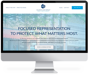
1. Azemika & Azemika
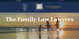
Azemika & Azemika is a family law firm. The initial image gives a feeling of peace and calm, which prospective clients may be looking for when going through a divorce.
As you scroll down their homepage, there is a professional photo of their team, and they discuss their dedication to their clients and their extensive knowledge of family law. This flows into their practice areas, ending the homepage with client reviews.
The navigation bar at the top of the screen is easily visible and easy to understand. They also provide links to their social media pages for visitors.
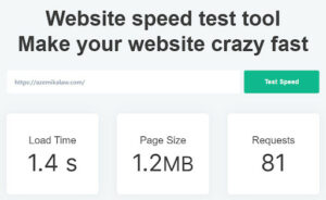
The website loads in 1.4 seconds, keeping users engaged and reducing bounce rates.
2. Jeremy Widder Law
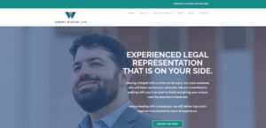
Jeremy Widder Law’s homepage message is clear and concise: “Experienced Legal Representation That is On Your Side.”, declaring their commitment to their clients from start to finish, with a professional image of the attorney.
As you scroll down the page, their message is reiterated. They are there to help ease your concerns and list their range of legal practice areas. At the bottom of the homepage, there is a CTA button to schedule a consultation and client reviews.
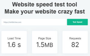
The navigation bar across the top is easy to understand. Their website also loads quickly to increase engagement and decrease bounce rates.
3. Pullano & Siporin

“Experience the Power of Promises Kept.” This is a strong message to convey the dedication of the personal injury lawyers at Pullano & Siporin. When you visit the website, instead of an image, there is a video showing the Pullano & Siporin team meeting with clients in their homes and the team at work in the courtroom.
There is a listing of awards their attorneys have won. Then, they provide information on their experience as trial lawyers, statistics of their success rates, top-dollar verdicts and settlements their team has won for their clients, and their experience in the courtroom.
Their homepage continues by discussing how they strive to make their clients feel comfortable, deliver outstanding client service, provide client testimonials, and end with how potential clients can contact them.
The navigation bar at the top of the screen is clear and easy to navigate. There are also navigation links at the bottom of the homepage.
4. Steve Newman Legal
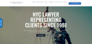
The Steve Newman Legal website homepage immediately conveys their expertise, stating they’ve been representing clients since 1991, with Lady Justice in the background. While they say they are a New York City law firm, they also disclose that they represent clients nationwide.
Their page continues showing awards that the firm has won, as well as client testimonials. This leads to practice areas and information about the attorney.
The navigation menu at the top makes it easy to flow between pages and find the information users are looking for.
5. BBG Construction Law
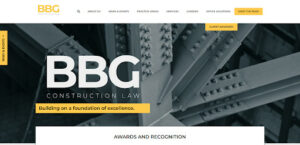
BBG’s message is front and center. They are an award-winning construction law firm. They list their awards and introduce you to their team.
The navigation menu is across the top. However, as you scroll, the navigation bar turns into a drop-down menu and is constantly accessible regardless of where you are on the homepage.
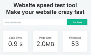
Their loading speed is extremely fast, which will help keep users on their website.
Trust the Award Winning Web Design Team at Conroy Creative Counsel
The methods employed by successful websites to engage first-time visitors are a delicate blend of art and science. By understanding and implementing these key elements, your website can stand out in the crowded digital landscape and turn first-time visitors into long-term advocates of your brand. Remember, a stellar first impression is not just a one-time event; it sets the stage for lasting engagement and success.
Conroy Creative Counsel specializes in designing outstanding customized websites for law firms that look great and drive results. Your website is a vital element of your brand and the first impression potential clients get of your law firm, so having trust in your web design experts is crucial.
Our design team has won awards for their innovative and effective websites for law firms. We stay on top of the latest trends and technologies to ensure your website is current and future-proof.
Contact us today to discuss how we can help design an effective website for your law firm.