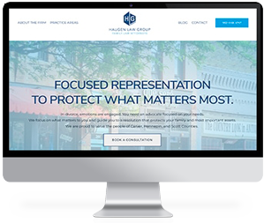
Choosing colors for the visual aspect of your law firm’s brand is more than selecting the perfect shades. Using color in your branding is more about the message you are trying to convey. Using the right colors can act as a beacon for your ideal client.
There are many aspects of color that you need to consider when choosing a color palette for your law firm’s brand. This article will act as a guide to help you create cohesive brand colors.
Principles of Color Branding

Your brand colors will convey your brand personality, goals, and values. Color branding is based on two primary principles: the psychology of color and color consistency.
- Color psychology explains how colors can evoke different responses and emotions in people. For example, red probably wouldn’t be the best choice in law firm branding as it conveys passion and energy. In contrast, blue may be an excellent choice as it conveys calm, trust, and professionalism.
- Color consistency means using the same colors consistently across all of your branding, such as your website, logo, and marketing materials. This helps to create a brand that clients will recognize easily.
Understanding Color Theory
You have likely heard of the color wheel. A color wheel is a diagram that shows the relationship between colors. Familiarizing yourself with the color wheel can help you choose cohesive colors for your brand.
- Primary colors (yellow, red, blue) are the foundation of the color wheel
- Secondary colors (orange, purple, green) are created by mixing primary colors
- Tertiary colors are a combination of one part of a primary color with one part of a secondary color
Complementary Colors
Complementary colors are on opposite sides of the color wheel (e.g., red and green). When complementary colors are placed next to each other, they create a strong contrast, making the colors appear brighter.
Complementary colors are used in digital marketing because they help bring a visitor’s eye to a particular focal point. However, it’s important to remember that using complementary colors together too much can become overwhelming and lead to visual fatigue. To avoid this, use complementary colors occasionally and balance them out using complementary shades of the same color or a neutral color.
Accessible Color Palettes
Using accessible colors is a huge part of branding. Visitors with visual impairments (such as color blindness) can find it challenging to navigate a website if the colors are not accessible. Accessible color palettes ensure sufficient contrast between colors, making it easier for visually impaired visitors to read and understand content.
Here are some tips to avoid unintentionally excluding some of your audience.
- Contrast Ratio — Aim for a sufficient contrast ratio between text and background colors (at least 4.5:1 for standard text) to ensure readability.
- Consider Color Blindness — Avoid relying solely on color to convey information. Use different shapes, textures, or patterns alongside colors.
- Test with Tools — Utilize online tools like Stark, Color Safe, or Accessible Colors to check the accessibility of your color choices.
- Opt for Simplicity — Limit your palette to a manageable number of colors to maintain clarity and simplicity.
Using Color and Text
Many of your brand colors will be used as the background for text copy and possibly the text itself. Choosing the correct colors is essential to ensure legibility and accessibility for your users.
Here are some ways the color of the text and background can affect legibility:
- When there is a high contrast between the background and text color, it makes the text more legible.
- Using dark text on lighter backgrounds makes it easier to read
- When there is low contrast between the background and text colors, legibility is reduced.
- Complementary colors increase legibility.
- Saturation and brightness of the background affect legibility.
Creating a Cohesive Color Palette for Your Brand
Here are tips for creating a cohesive color palette for your brand.
- Define Brand Personality and Audience — Understand your brand’s personality, values, and the emotions you want to evoke. Consider your target audience’s preferences and demographics.
- Start with Core Colors — Choose 2-4 primary colors that reflect your brand’s essence. These will form the foundation of your palette.
- Explore Complementary Colors — Identify complementary colors that enhance your primary choices. Experiment with shades and tints to find the right balance.
- Consider Contrast and Balance — Ensure enough contrast between text and background colors for readability. Aim for a balanced mix of light and dark shades.
- Test Accessibility — Use tools like WebAIM Contrast Checker to ensure your colors meet accessibility standards, especially for visually impaired users.
- Expand the Palette with Neutral Colors — Incorporate neutral tones like whites, grays, or blacks to balance and complement your primary and accent colors.
- Create Swatches and Test —Develop color swatches or a mood board to visualize how the colors work together across different mediums and platforms.
- Gather Feedback — Share your color palette with employees, clients, or potential clients to gather feedback and make necessary adjustments.
- Document Your Palette — Create a style guide or document outlining your brand’s color palette with color codes (RGB, HEX, CMYK) for easy reference.
Let Conroy Creative Counsel Help You Select the Most Effective Color Palette for Your Law Firm’s Brand
By following these steps and considering the principles of color theory alongside accessibility guidelines, you can create a cohesive brand color palette that resonates with your audience and ensures inclusivity and usability across different platforms and mediums. A well-crafted color scheme is a powerful tool for conveying your brand’s identity and establishing a memorable presence in the market.
At Conroy Creative Counsel, our team will guide you through ideal color palettes and typography that will align with the message and personality of your law firm’s brand message. We will help you select a color palette that will help evoke the right emotions in potential clients.
Contact us today, and let’s explore the results we can create together.