
Logo designing might seem like a relatively simple task to an outsider. However, that is part of the challenge of being a great logo designer—creating something that looks and feels simple, while still evoking the type of feelings and emotions the brand is going for. Popular logo designs become famous for a reason: they’re memorable and they make you feel a certain way whenever you see them, whether it’s subtle or in your face.
After all, a logo is more than just an image—it is a brand identifier, and in many cases acts as people’s first introduction to a brand. It is extremely important to create a great first impression.
5 Popular Logo Designs that Are Truly Remarkable
Here are a few examples of some famous logos and what makes them so special:
Organ Donation
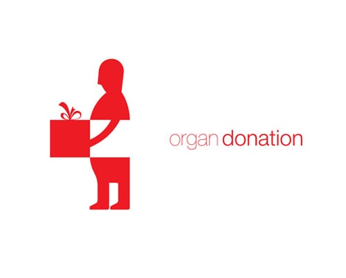 The organ donation logo is undeniably original. It immediately makes it clear what the logo is for while forging an emotional connection with the person viewing it. It also does not bear a resemblance to any other easily recognizable brand logos. While it is okay to take some design inspiration, it is ultimately most important to be as creative and original as possible.
Toys ‘R’ Us
 The Toys ‘R’ Us logo is a great example of one that is relevant to its intended audience. Its charming, playful font complete with backwards “R” is clearly intended to draw the attention of children and their parents. One wouldn’t even have to speak English to know this is the logo of a toy store.
FedEx
 The FedEx logo is a great example of one that is versatile and scalable. It maintains the same effectiveness whether it is on a business card or a billboard. The contrast in color makes it stand out from afar, and the arrow in “Ex” adds a sense of brand identity and purpose to the logo that fits with the company. No matter what size the logo is, it will maintain the same detail and legibility.
Nike
 Nike is a perfect example of a logo that is so memorable and iconic that a product with the logo emblazoned on it practically sells itself. Of course, it takes some time to build up the “iconic” status of a logo, and a whole lot of hard work with branding and marketing. But just about every iconic logo has this in common: they’re simple. One single “swoosh” check mark, one of the simplest logos you’ll find for recognizable companies, instantly invokes plenty of emotion in Nike’s target audience.
Disney
 Disney is an example of a logo that is timeless and pure. There is nothing trendy about the Disney logo—it has been the same for decades. This consistency has turned the Disney logo into a powerful branding tool over the years. Its simplicity (intended to mimic Walt Disney’s own signature) is a big part of this, of course, but it also shows how brands do not need to overhaul their logos just for the sake of change.
Popular logo designs become famous after careful design and implementation. If you want the same for your law firm, talk to us! For more information and tips about designing a powerful logo, contact us today at Conroy Creative Counsel.
What’s one of your favorite logos and why? What do you think are the key components to make a logo design popular?