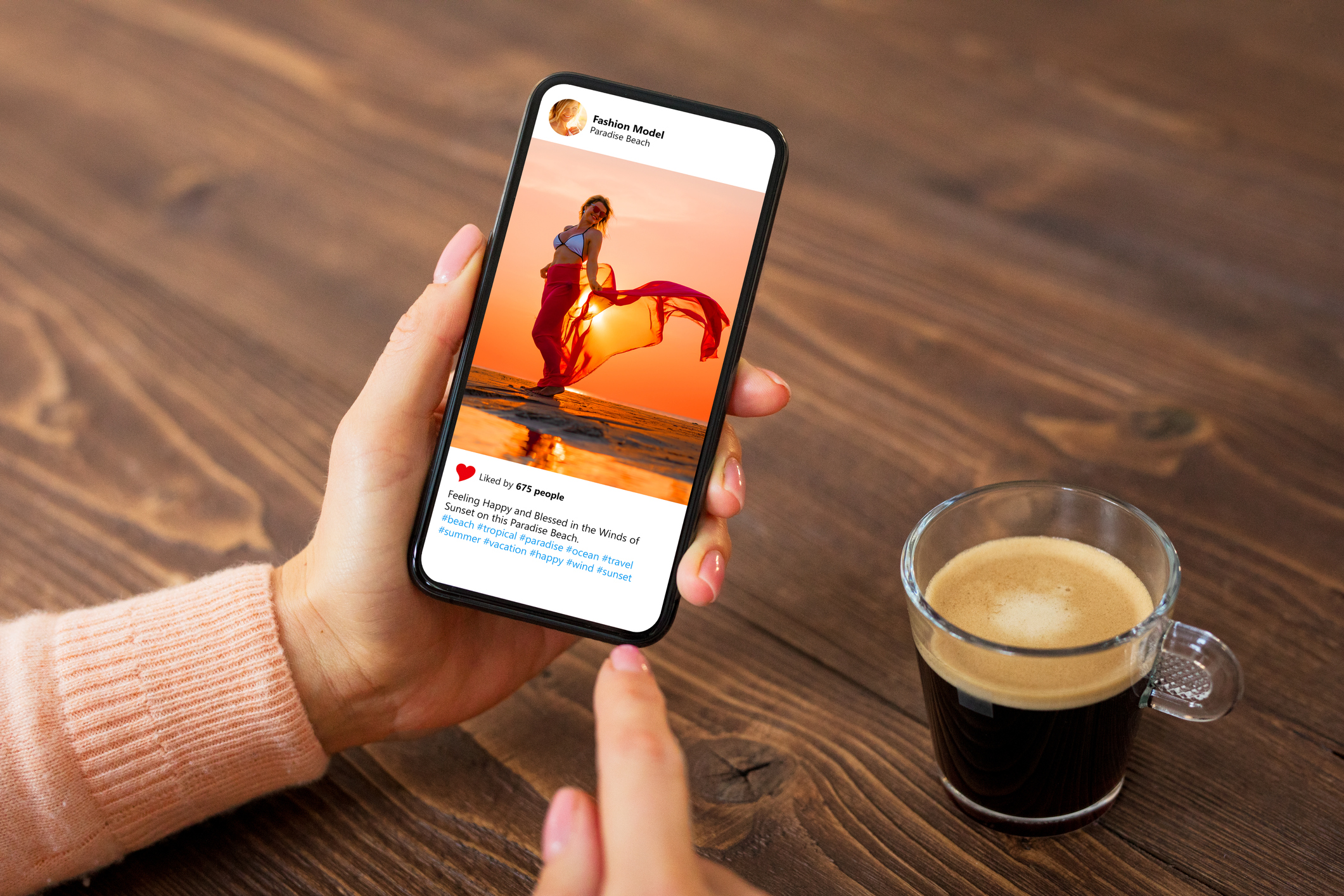
In an era where our lives revolve around the convenience of handheld devices, the way people access information has undergone a significant transformation. Mobile devices have become the go-to tool for seeking services, including legal counsel. As such, law firms aiming to engage potential clients and stand out in the digital sphere must prioritize mobile-friendly website copy.
The digital landscape has shifted remarkably, with a substantial portion of internet users preferring the convenience of mobile browsing. For law firms, understanding this shift and tailoring their online presence to suit their mobile audience’s preferences is essential in establishing a strong connection with prospective clients. This guide delves into the nuances of crafting website copy that resonates with users navigating legal websites on their smartphones and tablets.
Understanding the Mobile Consumption Trend
The mobile revolution has redefined the way we consume information. Studies consistently show that most internet users access content primarily through mobile devices. Some of the reasons for this include:
- Convenience and Accessibility — Mobile devices provide instant access to information anytime, and quick and easy browsing fits seamlessly into users’ fast-paced lifestyles.
- Time Efficiency — People often have limited time, and mobile devices allow them to consume content in short bursts, ideal for busy individuals seeking legal services.
- Preference for Bite-Sized Content — Scrolling through concise, easily digestible content aligns with the preference for quick information absorption on mobile screens.
What Does it Mean to Be Mobile-Friendly?
Having a mobile-friendly website means that visitors view a different version of your website when viewing it on a mobile device. A mobile-friendly website will give them a better experience. Here are a couple of ways you can achieve a mobile-friendly website.
- Responsive Design — The design of your website adjusts to adapt to the user’s screen size.
- Dynamic Serving — Different HTML and CSS codes are displayed depending on the type of device the user is using.
Tailoring Website Copy for Mobile Users
To effectively capture the attention of potential clients in the legal sphere, law firms need to adapt their website copy for mobile viewing. Here are actionable strategies.
Provide Concise and Scannable Content
When using their mobile device, readers want to get to the point as soon as possible, so replacing long, drawn-out paragraphs is essential. Use shorter paragraphs, bullet points, and subheadings to create easily scannable sections. Also, write in a clear, conversational tone, avoiding legal jargon or overly complex sentences that might alienate readers.
Prioritize Clarity and Brevity
Focus on key information by highlighting essential points and key services using compelling headlines and concise descriptions. Be sure to place crucial information at the beginning of paragraphs or sentences for immediate impact.
Strong, impactful headlines can grab readers’ attention and are the perfect way to communicate your message instantly. A well-written headline will inform your reader what they can expect and build their interest in reading further.
Optimize Readability
Remember that readers view your website on a mobile device with a small screen. No one wants to zoom in on every word, so use legible fonts with a reasonable size to ensure readability on smaller screens.
Using color can also help with readability. Ensure high contrast between text and background for easy reading, especially in various lighting conditions.
Responsive Design and Navigation
Having a mobile-friendly design ensures seamless usage for mobile users. Ensure your website is responsive, adapting seamlessly to different screen sizes and orientations.
When designing your website menu, keep mobile devices in mind. Having a huge menu that is impossible to read will send visitors to a more mobile-friendly website.
Utilize Images and Videos
When prospective clients are in a hurry, nothing can grab their attention like an image on a website. Not only are they eye-catching, but they can convey a message much faster than words.
Videos are also excellent for those browsing your website on a mobile device. They can watch the video while completing other tasks.
Elements of Website Copy Requiring Mobile Optimization
For law firms aiming to enhance their online presence, certain aspects of website copy demand special attention for mobile optimization.
Landing Pages
- Clear Call-to-Actions (CTAs) — Ensure prominent, concise CTAs direct visitors to desired actions, such as contacting the firm or scheduling consultations.
Service Pages
- Brief Service Descriptions — Provide brief overviews of legal services offered, emphasizing benefits and outcomes.
- Testimonials and Case Studies — Display short, impactful client testimonials or case studies that showcase success stories.
Blog and Resource Pages
- Snappy Headlines — Craft attention-grabbing headlines that instantly communicate the value of the content.
- Short Intros with Teasers — Hook readers with brief intros, offering a glimpse into the content’s relevance and value.
Contact Information
- Clickable Contact Details — Ensure phone numbers, email addresses, and location information are easily clickable for instant contact initiation.
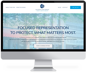
Trust Conroy Creative Counsel to Ensure Your Website is Mobile-Friendly
In a mobile-driven landscape, law firms must adapt their website copy to cater to the preferences and habits of on-the-go users. By implementing these strategies and consistently fine-tuning your website copy for mobile accessibility, law firms can establish a strong digital presence, making their services more accessible and appealing to potential clients navigating the digital world through their smartphones and tablets.
At Conroy Creative Counsel, we’re committed to helping law firms stand out with a powerful online presence. This includes ensuring that your website is mobile-friendly. Our award-winning design team stays abreast of the latest technologies and design trends to ensure your website is current and future-proof. We will ensure your website is responsive and optimized for all devices to ensure a seamless browsing experience whether your clients are on a laptop, smartphone, or tablet.
We’d love to help. Contact us today!


